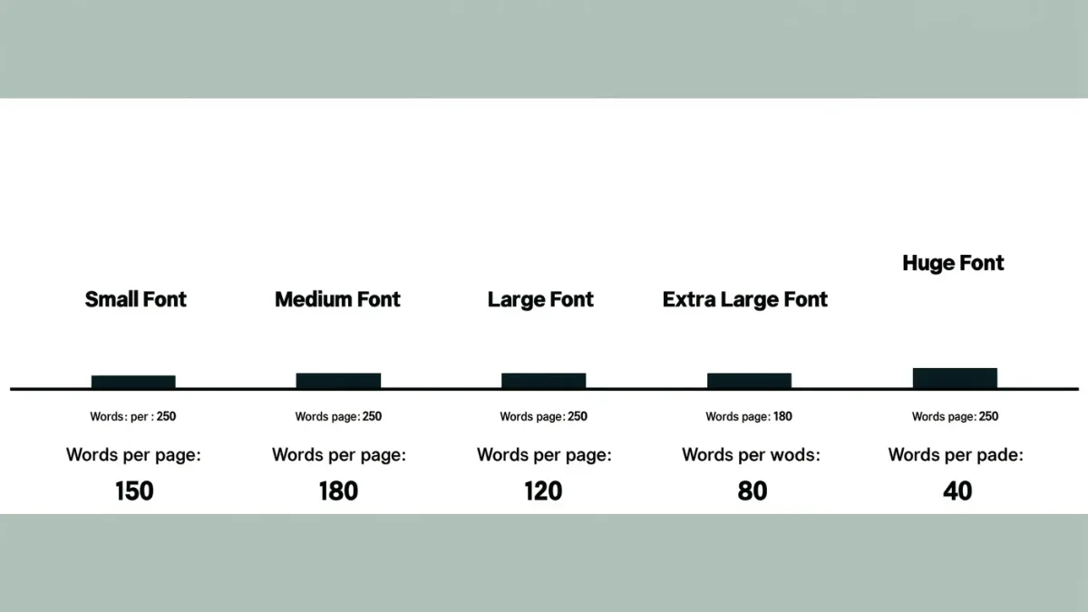
Large print on an e-reader means font sizes roughly from 7 up to about 14 point equivalents on Kindle, with more than a dozen steps plus separate bold-text levels, per Amazon's display settings documentation (2025). Kobo e-readers offer a similar ladder of sizes and, on many models, let you sideload custom fonts, per Kobo's help pages. That is enough magnification for many low-vision readers — but print disability is a wide spectrum, and at the top end of the scale the limits of fixed small screens start to matter.
Which settings control text size on a Kindle?
While reading, tap the top of the screen, then the "Aa" icon. Per Amazon's documentation, you get three levers that work together:
- Font size — a slider or grid of stepwise sizes, from small to very large.
- Bold — several levels of stroke weight, independent of size; heavier strokes help many readers more than raw size does.
- Layout — margins and line spacing, which change how many enlarged lines fit per page.
Amazon also ships a small set of typefaces, including a dyslexia-friendly high-legibility option, per its font list. The combination of size plus bold plus spacing gives you more usable ranges than size alone: a moderately large font at the highest bold setting with wide spacing is often more comfortable than the maximum size crammed at default spacing.
One Kindle-specific quirk worth knowing: some heavily designed books lock their typography, so the Aa controls do nothing. If the sliders seem dead, the file is the problem, not your device — returning to the publisher's default-flow edition fixes it.
What about Kobo and other e-ink brands?
Kobo's reader settings offer a comparable size ladder, adjustable weight on recent models, and the ability to add fonts by dropping files into a fonts folder over USB, per Kobo's documentation. That sideloading path matters: if a particular high-legibility typeface works for your eyes, you can make it the default across your library rather than choosing from a preset list.
PocketBook and Onyx Boox devices run broader font systems still — Boox is Android-based, so its reader apps can install any font an Android app can, per Onyx's documentation. The general rule across brands: the more open the device, the more typographic control you get. The more locked-down the ecosystem, the fewer, but safer, choices.
How big is big enough — and what are the real font limits?
There is no polite way around this: e-reader maximum sizes were designed for comfortable enlargement, not for severe low vision. At the largest Kindle settings you may see only a handful of words per screen, and each page turn becomes a small event on e-ink. Large-print print editions typically run 16 to 18 point or larger, per the National Library Service's large-print guidelines, and e-readers at their ceilings sit below that comfortably.
When the ceiling is too low, the practical move is changing class of device rather than fighting the settings:
- A 10-inch or larger e-ink reader puts the same font steps on a much bigger canvas, so maximum size covers more text.
- A tablet reading app adds system-level magnification on top of the app's own font settings.
- A screen reader adds speech, which sidesteps size entirely.
None of this is exotic — it is the standard escalation most low-vision readers land on after a year of pushing sliders to their stops.
Do font choice and contrast matter as much as size?
Often nearly as much. Per the Web Accessibility Initiative's guidance on text contrast, higher contrast between text and background measurably improves legibility, and the same principle applies to reflective e-ink displays. E-readers offer dark-on-light, light-on-dark, and on some models sepia or black modes; dark mode with light text helps some readers and bothers others, so test with a real chapter rather than a menu page.
Typeface shape matters too. Humanist sans-serif faces with open letterforms and distinct characters (a vs o, I vs l) read more easily at distance than condensed or decorative faces. The dyslexia-oriented fonts shipped by Amazon and Kobo are built on exactly those principles, per both companies' documentation — they are not magic, but the design reasoning is sound.
Finally, weight: many low-vision readers report that increasing bold gives more benefit per step than increasing size, because heavier strokes survive glare and partial acuity better than thin outlines at any size. Turn bold up first, then size, then spacing — in that order — and you will usually land on a better balance.
What should large-print readers check before buying?
Three checks before you spend anything:
- Screen diagonal. Bigger screens hold bigger text without collapsing to three words per page.
- Bold levels. Look for multiple weight steps in the spec or store demo, not just size steps.
- Unlocked typography. If settings matter to you, favor devices and stores whose books keep text reflowable.
And one habit after purchase: keep a test book you know well, and re-check your settings on it every few months. Firmware updates occasionally shuffle defaults, and a quiet regression in your bold setting is easy to miss across hundreds of pages.
Frequently asked questions
Can I make Kindle text larger than the Aa slider allows?
Not within the stock reader. The top of the size slider is the ceiling, per Amazon's documentation. For more magnification, use a larger-screen device, a tablet app with system zoom, or spoken output through VoiceView.
Does maximum font size work in every book?
Most, but not all. Books with fixed-layout formatting lock their typography, so the size controls do nothing, per Amazon's formatting guidance. Reflowable EPUB or KFX files keep the full range.
Which is better for low vision: bigger font or bold text?
They work together. Many readers gain more from increasing bold than from maximum size, because heavier strokes stay legible in glare and at partial acuity. Set bold first, then raise size only as needed.
For more context, read How Do You Read With Low Vision On Screens?.
For more context, read accessible e-reader.
For more context, read How Do You Turn Pages Without Using Your Hands?.